December 30, 2011

Floatingsheep's Top 11 of 2011

With the end of 2011 upon us, it is a good time to reflect on our year as a whole, especially the things we've been doing right this year. So in the spirit (of self promotion), we offer the Top 11 Floatingsheep posts of 2011!

1. The Price of Weed

Arguably our most successful map ever, and easily the most popular of 2011, at least 66,000 people have viewed this map on the blog -- not to mention all of the people who saw it in Wired Magazine and various other places around the web -- in just the four months or so since it was posted.

2. Preparing for the Zombie Apocalypse, Part I: Zombies or Old People?
An analysis of the spatial distributions of zombies and old people showed significant clusters of old people in Germany and France, but revealed a fairly random pattern across the United States. Remember to take caution when zombie hunting, as we want to minimize possible damage done to grannies everywhere.

3. Map of Per-capita Mobile Phone Subscriptions

Mark's map of mobile phone subscriptions across the world showed another slice of the digital divide: a country's wealth and ICT usage aren't universally correlated in the same way as, say, internet penetration rates, though the digital divide isn't always best measured at the aggregate level of the nation-state.

4. The Floatingsheep Take on Casual Sex

Our take on OKCupid's assertion that searching for casual sex is correlated with higher GDP per capita around the world. Really, all we found is that European's are very interested in casual sex.

5. Data Shadows of an Underground Economy

Interestingly enough, a post with no real maps was the 5th most trafficked post of the year -- though Matt, Mark and Monica's paper on the role of volunteered geographic information in measuring illicit economies of marijuana trafficking is very interesting.

6. The (Expanded) Pop vs. Soda Debate
Coke. Pop. Soda. Soft drink. We thought the debate would never end. Until we made this map. Oh, people still aren't done arguing about this?

7. Santa vs. The League of Darkness

Despite a year of less Holiday-themed maps this time of year, the comparisons of references to Santa, Satan and Zombies quickly became on of the year's most popular posts. Got any suggestions for next year's maps?

8. Mapping Male Enhancement: Distorting Size the Old Fashioned Way

Another post featuring no original maps, this was our critique of a dubious map purporting to know the average penis size across the world. A funny thought, but also a teaching moment for why issues of accuracy and authority continue to be relevant to those studying the geoweb.

9. Rise of the Slacker Strata

Though Monica's brilliant mashup of the Price of Weed and Beer Belly of America maps was only the 9th most popular post of the year, it has already been immortalized in a Floatingsheep t-shirt.

10. Geographies of the World's Knowledge
Some of Mark and Monica's work on mapping knowledge across the world -- from newspapers to academic publishers, to Flickr photos, Wikipedia entries and user-generated information in Google Maps.

11. Preparing for the Zombie Apocalypse, Part VIII: Voodoo

The final part of our extensive series on the virtual geographies of the zombie apocalypse, this post focused on the connections between zombies and their origins in Voodoo mysticism.

We expect 2012 to be another good year for us, so keep following the blog in the new year! And be sure to let us know if you have any suggestions for maps you'd like to see!

December 29, 2011

A few final holiday maps (that is if you consider zombies festive)

As part of the Floatingsheep quest to determine the mythological and ecclesiastical contours of the Web (and of course protect all of humankind from the impending zombie apocalypse), we present a final few maps for your enlightenment before the new year.

Wishing everyone a happy new year!
--------------------------------------------
We were a bit worried about North Carolina (and wonder if the Charlie Daniels band picked the wrong state) until we remembered Kill Devil Hills is the likely reason for this cluster.

Devil vs. Jesus
Similar results can be found in the map of Santa vs. Devil.

Devil vs. Santa
Given our earlier concern about the Zombie-Satan alliance we thought it would be worthwhile to see what the fault lines might be if the two sides had a falling out. Plus since we've been a bit overly U.S. centric, we thought a change of location was in order. The good news is that the U.K. seems generally safe from Satan but the bad news is that London is seemingly overrun with zombies...which explains a lot about my last visit.

Satan vs. Zombies

HO! HO! HO!

December 27, 2011

Mapping Panettone (Italian Christmas cake)

Today we are happy to present a guest post and map from our friends in LADEST at Siena University (Cristina Capineri, Michela Teobaldi, Claudio Calvino, and Antonello Romano). And unlike our recent fascination with the forces of evil vs. Santa, it entirely focused on the simply joys of eating. Enjoy!
--------------------------------------------

Given the large number of delicious Christmas cakes and sweets to overindulge on, it is little wonder that Santa is a fat jolly man! Indeed, one may wonder why Santa ever decided to use chimneys given the troublesome girth that builds up.

In Italy the traditional, seasonal delight is Panettone, or Italian Christmas cake. Its origins are mysterious. One version has it that the cook of the Sforzas, an aristocratic Milanese family, supposedly burnt the cake he had made especially for Christmas dinner and instead served his lords with a simple cake made from dough and sultanas. Another story tells how some poor nuns from a monastery near Milan baked a cake with the few ingredients they could afford. Yet another is about a man who was in love with a nice baker whose business was doing rather badly and who created Panettone with lots of love in it! Whatever the true origin, Panettone has become the symbol of the Christmas family reunion in Italy.

But Panettone has also acquired an increasingly international following with many people search for recipes and/or ideas of how to use up leftover Panettone. In fact, according Google Insights (which tracks search patterns across space) there are more searches for Panettone than Christmas pudding. The following maps are based on data gathered from Google Insights for Search “Panettone” (2006- 2010) with results narrowed to food and drink category. Besides differences among regions, data showed a clear seasonality: peaks always take place in December.

Looking specifically at Italy, people from southern cities (Naples, Catania, Palermo, Taranto) look for Panettone, which is one of the traditional delicacies from the North, almost as if eating Panettone were a sort of glue holding the Italian national identity together.

Google Searchers for "Panettone", Italy

At the European level Panettone has spread to almost every country in western Europe, as well as Poland and Hungary, and has become an European food.

Google Searchers for "Panettone", Europe

The global scale shows a “nostalgic” pattern: the search is particularly common in countries where the Italian immigrant community is large, such as the US, Brazil, Canada, Venezuela and Argentina, as if people were searching for their culinary roots. It is worth noting that food culture is one of the areas that changes more slowly among immigrants, because food has a central role in many social rituals and communication patterns within families and communities.

Google Searchers for "Panettone", Worldwide
Enjoy Panettone and Happy Christmas from Ladest (Siena University, Italy)

December 21, 2011

Holiday Map Contest Winner: Santa vs. Satan

We are happy to announce that Duane Griffin of Bucknell University is the winner of the Floating Sheep "Mapping Santa" contest. His entry combined a flair for cartographic representation with a willingness to combine unconventional data (details here) to create what we think is a truly terrifying map. It is truly one of the creepiest things we’ve ever seen associated with the holidays (and that is saying something!).


So, put the kids to bed, block up the chimney and hide the retirees....someone is coming to town and they are pissed! Even Santa looks rather menacing in this map. So, congratulations to Duane for this mark of distinction dubious honor. We can only hope he has the good sense to keep it off his c.v.

Don't forget, we're running a second round of this contest with entries due on Friday! In particular, we'd love to see some maps of the United Kingdom.

Contest Rules and Data
  1. The data is available in shapefile and excel versions. See the excel version for the metadata and other information about how the data was generated.
  2. Email your entries to zook@uky.edu
  3. Entries must be received by Friday December 23rd by 8 am EST. (Apologies for the tight deadline but we're getting this post up later than planned). We'd like to post all the entries to the blog by the 23rd or 24th.
  4. By entering you agree to allow us to post your visualization on the FloatingSheep.org blog and under a Creative Commons Attribution-Noncommercial-Share Alike 3.0 Unported License.
  5. Winners will be decided by the FloatingSheep collective as advised by comments to the posts here.
  6. Winners will receive a honest-to-God Floating Sheep ornament and a Slacker strata t-shirt. Both of which are also available for your purchase and pleasure.
If you have any questions... feel free to ask us in the comments section.

December 19, 2011

The Santa contest entries and a second round

We want to thank those who entered our contest for Santa-themed maps. We're quite happy with the range of entries and are currently deciding on a winner.

We wanted to share them with you in the hope of inspiring new entries. We suspect that there is many a GIS person at work without much to do (after all, you're reading this blog right now) and this week would be a perfect time to make a map. Not many people around the office, just marking time on the clock until the end of the year break. Although the first contest is over, we're running a second round with the same rules and prizes (see here). All entries have to be emailed by 8am EST on Friday, December 23rd.

But on with this round of maps.

* * * * * * * * * * * * * * * * * * * * * * * *

First, is a quasi-entry from someone who may want to remain anonymous given the incomplete nature of this map. He notes, "Didn't have time to develop a complete plan for the Santa vs. Zombies contest, but did find a nice image of brains on a silver platter, live traced in Illustrator, then imported as a symbol into ArcMap." Well done we say, but why not take some time this week to further develop it? Tons of potential here.


* * * * * * * * * * * * * * * * * * * * * * * *

Our second entry is from Ate Poorthuis who went the open-source GIS route. Using QGIS and Photoshop he notes, "no fancy analysis from me this time but thought the Jesus versus Devil thing was kind of fun. Obviously the devil clusters are related to place names. The most prominent ones are Kill Devil Hills, NC and Devil's Lake, WI. Nonetheless, you can see the Bible Belt and Salt Lake City quite clearly. I have no explanation for the cluster around Seattle - most other cities have at least a devil point or two + Seattle doesn't strike me as the most religious city in the US."

Indeed, the results for Seattle are rather surprising. Perhaps it is tied to the "mellowness" we documented in the area that even makes the devil more laid back.

* * * * * * * * * * * * * * * * * * * * * * * *

Our third entry comes from Duane Griffin [1] with a map that we're quite frankly really creeped out by. I made sure my laptop was closed last night so it couldn't escape.


Duane outlines his method as, "I aggregated all of the Satan/Lucifer/zombies/etc. as Team Satan, aggregated all the religious and holiday categories and everything else as Team Santa (including fatman and robot santa), and mapped them Fox-style to hype up the threat. The "Mostly" category is based on the team ratio." The result is a road map of "badness". While Las Vegas comes as no surprise, who knew that Wyoming was so Satan-ridden? And I'm going to think twice before heading out to the middle of Kansas. Duane simply notes that it "Looks as if the Forces of Evil are winning the West and making inroads into the eastern US." Others (e.g., my mother) notes with some surprise that Washington D.C. shows up as mostly good which defies all expectations.

Happy holidays! And stay tuned for more posts.


[1] Other identifying information such as his role as a professor at Bucknell University has been withheld so he is not tainted by his admission of being a Floating Sheep reader. [2]

[2] Oops.

December 16, 2011

Santa vs. The League of Darkness (Zombies allied with Satan!)

Merry Christmas!….hopefully. But you may want to check out the maps below before heading out for the holidays as our analysis of holiday related references in the U.S. is NOT all candied sugarplums. In fact, there seems to be something rather sinister lurking in the hinterlands…and we're not just talking Newt Gingrich here.

Using our standard method to chart the number of hits for search hits at a grid of locations in the U.S., we recently compared the distribution of references to "Santa" and "Zombies". We thought there would be little chance that the shambling brain-dead fixtures of horror movies would be more popular than a jolly old elf distributing presents but we once again underestimated the American populace's ability to fixate on the "naughty" rather than the "nice".

In any case, the map below clearly shows that while most of the country is all keen about Santa, a few pockets including just outside the San Francisco Bay and Seattle and the cities Houston, Dallas and Austin in Texas have a lot of zombie angst. Hmmm…it might be the only things these places are in agreement on. But one of the more interesting clusters runs from Tampa to Orlando Florida….home of Disney World. Sort of makes sense in a way. Also of interest is a thin band of zombies stretched out along the Eastern seaboard, west of most of the major metropolitan areas.
The fact that zombies outrank Santa is a bit shocking but here at Floating Sheep we always look for the cause behind the pattern. Towards this end we decided to compare Santa vs. Satan. Surely, Santa would win this contest! Sadly there remain stubborn pockets of non-Santa-ness in the U.S. although in the West they are smaller than the zombie clusters (hmmm, new junk food idea?). Conversely in both Texas and Florida Satan clusters are bigger than the Zombie clusters observed earlier. And the line of preoccupation with Satan remains behind eastern seaboard cities, so I guess folks from New England and the Mid-Atlantic should drive carefully and not pick up and shambling or horned hitch-hikers they may see.
We are a bit concerned about this Zombie-Satan alliance and therefore will be spending our Christmas barricaded behind closed doors and with our shotgun pointed at the fireplace just in case. So Santa, if you are reading this, you might want to see if anyone is selling red Kevlar.

From the FloatingSheep headquarters we now sign off.

p.s. If you would like to try your hand at mapping Santa vs. Satan (including data for the U.K.) you can download the data here. We're running a contest (complete with prizes!) for the best reader designed map.

December 14, 2011

The Holidays are Upon Us: A Contest for Our Readers

This month marks the two year anniversary (more or less) of the Floating Sheep blog and we've made a tradition out of having some fun with mapping Santa. In 2009, we did a general mapping of Santa and Reindeer and last year we did the twelve posts of Santa where we looked at the geography of various local names for Santa Claus in Europe.

This year we're taking a look at the age old question of which is more popular, Santa or Zombies? OK, not really an age old question but we've been on a bit of a zombie kick as of late and thought it was a question worth asking. And just for the fun of it, we decided to add include some searches for the anti-Santa: Satan... which strangely enough is almost the same text string. Then because adding in religion is always fun we included a range of terms from Christianity and other religious traditions. After all, what are the holidays without the faux "annual war on christmas" controversy? Then, just because we thought of it, we added in the search term "Fat Man" to see what that might bring.

But the most innovative thing we're doing is passing along the data the data directly to you [1]. Including shapefile and excel versions. See the excel version for the metadata and other information.

We'd like to see what kind of visualizations readers can create. To add a little incentive, we're making it a contest with the winner receiving a honest-to-God Floating Sheep ornament and a Slacker strata t-shirt. Both of which are also available for your purchase and pleasure. They make excellent gifts, no matter which holiday you celebrate this time of year!

Contest Rules
  1. Email your entries to zook@uky.edu
  2. Entries must be received by Monday December 19th by 8 am EST. (Apologies for the tight deadline but we're getting this post up later than planned). We'd like to post all the entries to the blog by the 20th.
  3. By entering you agree to allow us to post your visualization on the FloatingSheep.org blog and under a Creative Commons Attribution-Noncommercial-Share Alike 3.0 Unported License.
  4. Winners will be decided by the FloatingSheep collective as advised by comments to the posts here.

If you have any questions... feel free to ask us in the comments section.

[1] And no, we're not just passing along the data because were lazy. For the record, while we are undoubtedly lazy, we actually have mapped the data and will be posting the maps next week.

December 13, 2011

Mapping Wikipedia Article Quality in North America

The maps of Wikipedia previously posted on the blog offer useful insights into the geographies of one of the world's largest platforms for user-generated content. They, along with similar visualizations, reiterated some of the massive inequalities in the layers of information that augment our planet.

But not all articles are created equally, and those maps didn't give us much of a sense of the quality of articles. "Quality" is obviously a slippery word and there are infinite ways of measuring it, but for the purposes of this post, we'll crudely use the term to refer to article length (future maps will employ a variety of other metrics).

The maps below visualize this measure of quality within Wikipedia entries -- yellow dots represent the location of relatively short articles in the English version of Wikipedia (e.g. the article on "Bandana, Kentucky"), while red dots indicate the location of relatively long articles (e.g. the articles on the "Republic of Molossia".


The map below displays the same data, but with smaller dots: making it easier to see some of the patterns if you expand the image.


Interestingly, the states with the highest average word counts are New Jersey (966) and Michigan (914). The states with the lowest averages are Delaware (534) and West Virginia (492). The reasons for these rather large differences are unclear.

Are Wikipedians from New Jersey that much more loquacious than their West Virginian counterparts? Or does it just take more words to describe the many dazzling wonders of New Jersey? Or is it something else entirely?

Apart from the obvious and increasingly evident urban bias in these information geographies, we'd certainly welcome your thoughts in explaining some of these patterns.

December 09, 2011

Announcing the New Mappings Collaboratory


I'm happy to announce the formation of the New Mappings Collaboratory associated with the Department of Geography at the University of Kentucky. It is strongly tied to the research interests of the Floating Sheep blog but also includes new areas of interest (see below) brought by the department's new GIS faculty. I encourage students interested in graduate studies in these areas to apply for study at the University of Kentucky.

“New Maps” draws upon both applied and conceptual traditions in mapping practices and mapping thought and represents a stream of scholarship focused on public engagement, “big data” and user-generated Internet content, as well as experimentation in place-based thinking, analysis, and representation. As a catalyst for mapping engagements on and off campus, New Maps works to promote creativity, excellence, and interaction around emergent mapping and GIS technologies. A range of faculty from the social sciences, humanities and natural sciences (in addition to Geography) are engaged with the New Maps project.

Current faculty and graduate students research projects/interests include:

  • Collection and analysis of a range of user generated data including Twitter Tweets, Google Placemarks and Flickr photos;
  • Analyzing the spatiality of online social networks through volunteered geographic data;
  • Working with community partners to design and build participatory GIS and mapping tools and products;
  • Citizen science in the production of scientific knowledge, including do-it-yourself aerial image capture using helium balloons and kites;
  • Applying GIS techniques to the digital humanities and related disciplines; and
  • Ethics, implications, and the use of geographic information and technologies in an age of ubiquitous location and surveillance.
More details on applying for graduate study are available here. The deadline for applications is January 15, 2012. Fellowships and teaching assistantships (including full tuition waivers) are available on a competitive basis.

For more information please please contact me or Dr Jeremy Crampton or Dr. Matthew Wilson.

December 05, 2011

Malamanteau and the Floatingsheep tribute to Wikipedia


Despite the fact that FloatingSheep does not exist on Wikipedia, we love the project. And as a testament to our love for the encyclopedia, we wanted to put together a list of our favourite articles. What emerged is that we don't just like geography-related info, such as the article on places with fewer than 10 residents or Bir Tawil (one of the few places on Earth not claimed by any country), but also more, er, esoteric subjects.


Here's our list. Bonus points to anyone that can combine them all into a poem.
Malamanteau
Zorbing
Global Orgasm
Infinite Monkey Theorem
Accessory breast
and, last but not least, the Enumclaw horse sex case.

We promise many many maps of Wikipedia soon (none of which will unfortunately involve any of these terms).

November 24, 2011

The “Thanksgivingest” place in the United States

By popular request (Ok, one person mentioned it) we are pleased to re-post our analysis of Thanksgiving from 2010. Besides we didn't manage to pull together a new holiday post in time. Happy Turkey Day!

---- Originally posted Thanksgiving 2010 ----

Given the interest last year in our “Search for Santa” posting it seems only natural for us to also analyze the spatial dimensions of other holidays. Given the upcoming Thanksgiving break (which has resulted in a campus wiped as empty as a post-dinner sweet potato and marshmallow casserole dish) the remaining cadre of the FloatingSheep faithful turned their penetrating gaze (much like Uncle Lester when the pumpkin pies come out) to the age old question: what is the most “Thanksgivingest” place in the United States?

OK, maybe we just made that question up but it makes a nice rhetorical flourish.

Drawing upon Google Maps data from November 2010, we calculated the presence of the keyword “thanksgiving” in the geoweb (or cyberscape) layer of 14,000 unique points in the lower 48 states. The map below illustrates the resulting spattering of thanksgivingness across the golden brown skin of the United States with large metropolitan areas representing moist succulent slices of holiday spirit; the veritable “breast meat” of Thanksgivingness.

Raw Thanksgivingness, November 2010
The raw score, however, is merely the appetizer of a multi-course analysis, such as standardizing for the overall size of the geoweb at each point. (Hopefully the first map has not ruined your appetite). This metric is akin to a per capita measure (e.g., income per person) except it represents Thanksgivingness per Geowebnicity. Points that scored high on this measure had a larger proportion of their spatial web activity focused on Thanksgiving (see the map below).

Thanksgivingness per Geowebnicity , November 2010
Just as tilting your dinner plate will shift the location of cranberries, this standardized measure reconfigures the spatial visualization of Thanksgivingness. Interestingly much of the Eastern United States and large metropolitan areas drop out of this visualization. In contrast, areas such as southern Utah and northern Arizona, the central valley of California and the Cascade range in Washington and Oregon rise faster than a Butterball pop-up turkey timer. Clearly by this standardized measure the Western U.S. is Thanksgivinger than the East. Although the site of the original Thanksgiving (Plymouth, MA), Key West and the interior of Maine also seem to have gotten “their turkey on”.

The final entrée of this research is a hot spot analysis (based on the Getis-Ord Gi* statistic) that looks at both the values of individual points but also the values of its neighbors. Concentrations of spots with statistically significantly high values are designated “hot” while locations with uniformly low values are “cold”. The map below highlights the contours of “hot” and “cold” concentrations (based on standardized data) for Thanksgiving. Areas without dots were not found to be statistically significant concentrations of hot or cold.

Hot and Cold Spots for Thanksgivingness per Geowebnicity, November 2010
One sees hot spots (represented in shades of red) of “Thanksgiving-ness” spread like a rich (albeit seemingly randomly distributed) gravy over the landscape of the western U.S. Upon closer inspection, however, it is easy to distinguish the “wishbone of thanksgiving” expanding from its base south of El Paso, TX across New Mexico and Arizona before cleaving into twin clavicles at the apparent fulcrum point at Las Vegas, one of the few major metropolitan areas that ended up as a “hot spot”. Must be all the buffets.

From Vegas, one branch of the wishbone expands eastward through northern Arizona and Utah before a splintering end at the edge of Montana and the Dakotas while the other moves up California’s central valley and along the Cascades before settling in at Seattle. A hot spot of Thanksgivingness is evident along the Big Sur coast between Monterey and San Luis Obispo where evidently people have a lot to be thankful for. The same goes for Key West and also apparently (and rather surprisingly) the interior of Maine.

But with the hot also comes the cold and we need consider those areas trending more towards “Thanksgivinglessness” (represented in shades of blue). Spreading from Michigan to the gulf coast like an unappetizing mound of congealed mashed potatoes, these cold spots dominate much of the non-coastal Midwest and South. Even FloatingSheep’s headquarters in Lexington, KY seems immersed in a decided cool (verging on gelatinous) spot in distribution of Thanksgivingness per Geowebnicity.

Of course this analysis is based on the level of Thanksgiving in the geoweb so interpret it with that in mind. Still it does seem that Key West, Las Vegas and the Big Sur coast demand further fieldwork on this topic. So it seems like my winter break plans are in order.

And central Maine? Sounds like an excellent chance for the enhancement of graduate student education.

Happy Thanksgiving….

p.s. Many thanks to Jeff Levy who generated the maps for this posting.

November 18, 2011

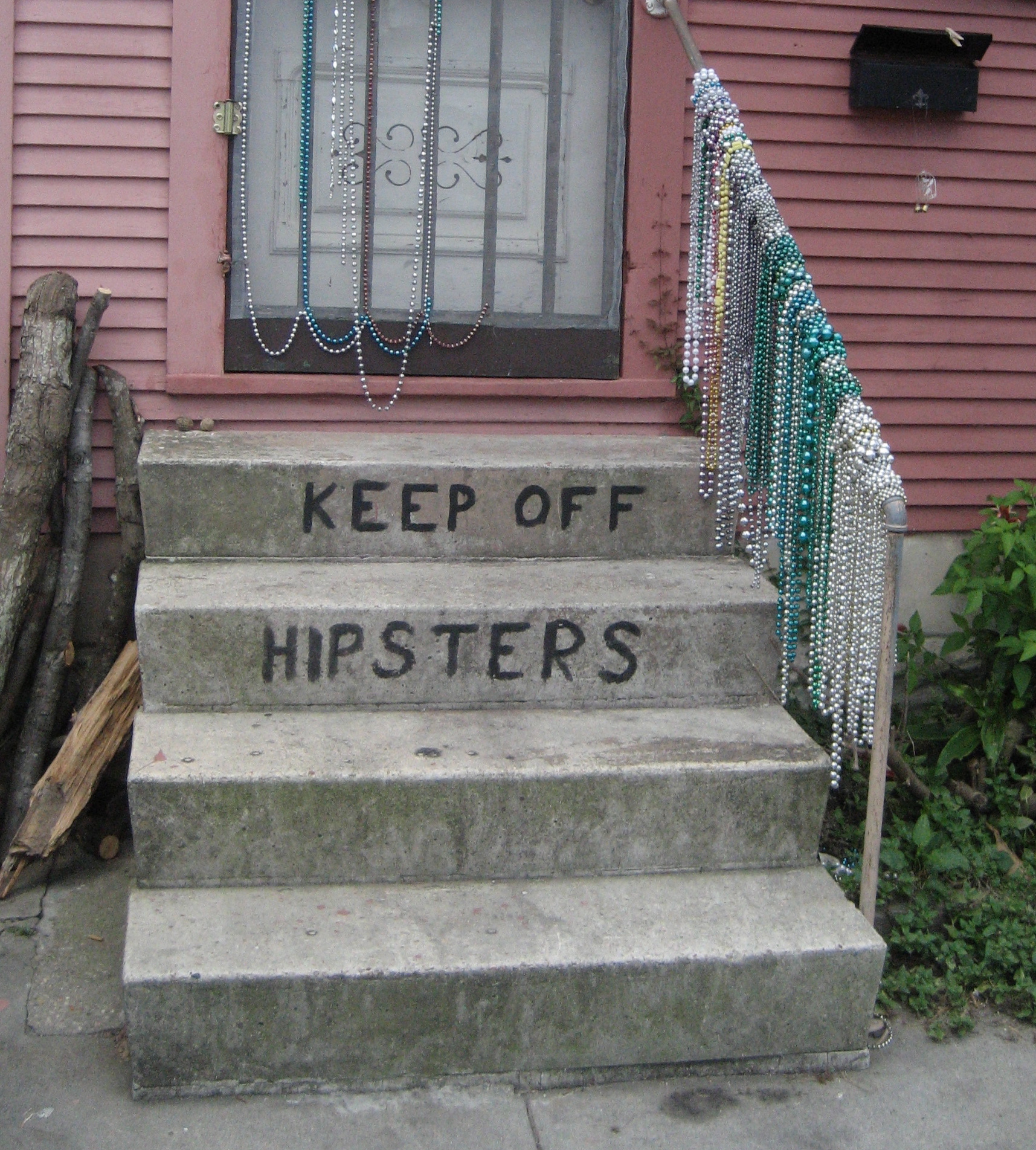
Geography of Dirty Hipsters

Did you every wonder where the highest concentration of results for the search term "dirty hipster" would be? Well we did, and building upon our last post the findings (limited to the U.S.) are below.

Largest Concentration of References to "Dirty Hipster"


View Larger Map


Second Largest Concentration of References to "Dirty Hipster"


View Larger Map

November 16, 2011

The tea party, hipsters, and the methodological limitations of Internet mapping.

America traditionally likes to party. Well, at least engage in the throwing tea off ships into harbors and annoy-the-English kind of party. And let's face it, who doesn't enjoy annoying the English now and again?

Arguably poking fun at the English is the only activity that the two groups we are comparing today -- the new "tea party" movement and "hipsters" -- may share in common. Or not. Both groups probably enjoy a party and the occasional beer. Of course, "tea partiers" will be complaining about taxes on alcohol and "hipsters" will be drinking the beer ironically whilst watching other people party and discussing bands you've probably never heard of.

Unfortunately, parties really have very little (OK, nothing) to do with this post, but they are a (rather forced) way of introducing our comparison of online references to 'hipsters' and the 'tea party'.
Interestingly, America is covered by far more references to the tea party than to hipsters. There are a few pockets of expected hipsterdom: San Francisco, Los Angeles, New York City, and of course Seattle. But otherwise the country is characterized by far more online attention given to the tea partiers. But we need to ask why that is? Is it because tea partiers have an identity they like to flaunt, whereas hipsters might tend to see the essence of hipster identity in others rather than themselves? After all, who really ever admits to being a hipster?

Or perhaps the technology itself is an explanatory factor here. Whilst (hipsters love to use the term whilst) we are somewhat shocked that the tea party, or at least people who talk about them, are harnessing the power of a technology designed and sponsored by the American/socialist/fascist/Kenyan government that is the subject of so much of their ire, they nonetheless maintain an impressive web presence.

Hipsters on the other hand, undoubtedly are proficient social media users, but we doubt they are using the word "hipster" on their sleek tumblr pages. Perhaps it would simply not be ironic enough? Other varieties of hipster, like their tea-throwing brethren of yesteryear, might eschew modern technology altogether and communicate using hand written notes or retro typewriters or cool early 20th century printing presses requiring months of careful restoration. In any case, in contrast to tea partiers, hipsters' general lack of self-professed identity means that they are less likely to create digital traces explicitly referencing themselves online.

And, ultimately, this is the point of this post. Mapping keywords in Google is often an incredibly useful exercise, but it can take hipsters and tea partiers to demonstrate some of the significant methodological limitations of such an exercise.

November 14, 2011

Mapping Wikipedia Globally

Wikipedia is an incredibly impressive coming-together of human labour on a scale that the world rarely sees. Over the last few years, we've also seen a few maps of the encyclopedia (including some work on this blog) which have shown that the project is far from complete (whatever that might mean).

That doesn't mean we should stop mapping the project though, and as part of a multi-year project to study Wikipedia in the Middle East, North Africa, and East Africa, we present this global-scale maps of every article in the November 2011 version of the English Wikipedia.
The English encyclopedia is by far the largest, and currently hosts almost 700,000 geotagged articles (click on the image for a larger and more detailed version):


Each one of these yellow dots represents human effort that has gone into describing some aspect of a place. The density of this layer of information over some parts of the world is astounding. Some of our future posts will look more closely at measures of inequality in Wikipedia, but it is still hard not to be awed by this cloud of information about hundreds of thousands of events and places around the globe.What we can also do is compare the English Wikipedia to the Arabic, French, Hebrew, and Swahili versions (these languages are chosen because they are the subject of the research project mentioned above).


This map should be interpreted with caution for a few reasons. First, it only displays content from six Wikipedias (there are currently 282 of them). Second, many articles in multiple languages appear in the same place. The reason for this is that they are articles about the same feature, event, or place: albeit in different languages. This means that when mapping those features, the dots in each language will show up on the map in exactly the same place. As such, we get a lot of overlapping dots. And dots that higher up in the legend will then necessarily show up on top of others.

The map still remains useful to show some of the different geographical foci of different linguistic groups. In Iran, for instance, there are more articles in Persian than any other languages in our sample. We see more articles about Quebec and parts of North Africa in French, and then a complicated mix of Arabic, Hebrew, English and French in the Levant.Nonetheless it remains that there are far more English language articles than articles in any other language. As such, it remains that if your primary free source of information about the world is the Persian or Arabic or Hebrew Wikipedia, then the world inevitably looks very different to you than if you were accessing knowledge through the English Wikipedia. There are far more absences and many parts of the world simply don't exist in the representations that are available to you.

November 10, 2011

The Rise of the Slacker Strata

"The key to economic growth lies not just in the ability to attract the creative class, but to translate that underlying advantage into creative economic outcomes in the form of new ideas, new high-tech businesses and regional growth."--The Rise of the Creative Class, p. 244
We suspect that many of our readers are familiar with Richard Florida’s argument about the creative class and its connection to economic development. His very provocative and controversial ideas about how cities and regions can strategize for home-grown innovation and economic growth offer a welcome relief to many from stadium building boondoggles in urban areas across the world.

But of course, given the streak of contrariness (or sideways thinking) that epitomizes the FloatingSheep collective, we began wondering what the opposite of the creative class might be: The Boring Bourgeoisie? The Insipid Intelligentsia? The Lackluster Lineage? The Dull Derivation? The Mundane Moiety? Apologies, but once you get started it is hard to stop.

Even more fun, is thinking about the kind of public policy initiatives that could be put in place to attract these populations. Although we admit we’re at a bit of a loss as to why it would be in cities’ interest to do so.

Then it occurred to us that our two most popular maps – the Price of Weed and the Beer Belly of America – contained within them the means to provide a metric of sorts for the anti-creative class. Or at least places where the ability to be usefully creative would be severely compromised, i.e., where the price of marijuana is low and the available of bars is high [1].

In other words, we're looking for the Slacker Strata of America, the list that no city wants to be on.

Given the short attention span of our target audience for this map (the Slacker Strata) we kept our analysis simple and just “smushed” the Beer Belly map together with the Price of Weed map and added some more appropriate symbology.

The Slacker Strata

(please click for a larger version of this map)

Given the decidedly flippant approach to this map, interpret with care. One thing that does jump out is that many places that have a relatively high level of geotagged information about bars, also have relatively high prices for marijuana. Wisconsin and Minnesota (with the high concentration of PBR cans in the map) consistently show up as high price locations according to the Price of Weed data. Likewise, the places with the lowest marijuana prices generally do not have high numbers of bars, with the possible exception of Northern California and Taylor’s hometown of Louisville, KY.

Nonetheless, this visualizes an intriguing relationship, leading us to make an initial hypothesis that these two goods largely act as substitutes to one another, at least when considered at the macro-scale. This idea, of course, still needs testing so hold off on any public policy decisions!

btw, this map is now available in t-shirt form!

Stay tuned for our next post when we map hipsters!

[1] We’re sure that some readers are bound to argue that they are at their most creative when partaking. We have our doubts and request that said readers review the documentary evidence provided here, here, and here.

November 07, 2011

Where are visitors to Floating Sheep coming from?

Recently we were wondering about our own user generated geographies and took a look at Google Analytics to see some stats on our visitors. We were hoping to download and geocode/map IP addresses but Analytics doesn't seem to keep that. So instead here are some of the maps (which annoyingly use the Mercator projection) that were available.

First, we've had visits from 201 countries/territories. If anyone knows someone in Turkmenistan, Western Sahara, Guinea, Sierra Leone, Liberia, Niger, Chad, the Central African Republic, Congo, Gabon, or Suriname please pass the link along. We'll take care of getting our long time nemesis Kim Jong Il of North Korea to look at us.


Dropping down to the city level, we note that we've had visitors from over 19,000 different cities. The top cities are (1) New York, (2) London, (3) Chicago, (4) San Francisco, (5) Washington, (6) Lexington, (7) Madison, (8) Seattle, (9) Los Angeles, (10) Minneapolis, (11) Sydney, (12) Portland, (13) Oxford, (14) Austin, (15) Denver, (16) Milwaukee, (17) Dallas, (18) Houston, (19) Atlanta, (20) Melbourne, (21) Philadelphia, (22) San Diego, (23) London, (24) Singapore, (25) Tucson, (26) Paris, (27) Toronto, (28) Berlin, (29) Cambridge and (30) Moscow.

But enough navel gazing...we'll get back to our regular maps next post.

November 03, 2011

Geocoding Historic Photographs in Lexington, KY

As part of my undergraduate iWorlds class this semester, I assigned students the task of geocoding historic photographs of Lexington, KY. The photos, which are available online in digital format, are housed at the Kentuckiana Digital Library at the University of Kentucky and have metadata that includes street addresses, albeit usually embedded in a paragraph rather than as a separate field.


After aggregating all the students' work, I played around a bit with some kml code and ended up a map of 500+ geocoded historic photographs. I’ve posted the kmz file which can be opened in Google Earth. Click on a placemark and you can see the photograph and a link to the KDL entry. Thanks to Matt Wilson for alerting me to these photos and Deirdre Scaggs for helping us access them easily.

October 31, 2011

Happy Halloween from Floating Sheep, Part II: A Zyberscape of Zweets

The denizens of Floating Sheep space are beginning to explore Twitter and there is a need to experiment with the API interface and various datasets. So what better way to do this than to use zombies! [1] So that we can visualize "a zyberscape of zweets"!

Location and Relative Amount of Tweets referencing Zombies (Zweets) Worldwide

The kmz for this (including the individual tweets) can be downloaded as well

Ate Poorthuis (a Ph.D. student at the University of Kentucky) spear-headed (pun intended) the zombie data collection process, which is relatively straightforward. The method was to use Twitter's Streaming API to download all zombie-related tweets between October 28 and October 31. We collected all messages containing references to zombies, undead and the apocalypse which appeared at a rate of about 45 tweets per minute for a total of 230,000 tweets. That's a lot of zombie angst!

We also thought it would be interesting to look at other forms of zombie-tude and turned to the fount of all knowledge to search the term "zombie politician" which returned many references to Newt Gingrich. So we added Newt to the list of search terms. Unfortunately there were so few geocoded tweets referencing Newt (perhaps lending some credence to the zombie politician label) that the resulting map looked as sparse as the teeth in a .... wait for it .... zombie. Rimshot!

Unfortunately, only 1.1% of those tweets were geocoded. While the profile of each Twitter user also contains a user-defined location field we decided to only use the coordinates of the actual tweet. These can be generated by a GPS-enabled phone or by 'smart' Twitter clients. Most tweets are geocoded to a specific point but others refer to a polygon (e.g. a city), in which case we've used the centroid of the polygon.

In any case, the end result is a database that shows the location of geocoded tweets containing the keyword "zombie". A few tweaks and the acquisition of a nice zombie icon later resulted in the cyberscapes (or perhaps more accurately zyberscapes) of zombie tweets (also know as Zweets) featured above and below. While the normal patterns of technology use are present (high concentrations in the U.S. and Europe) there are also a relatively large number (compare to other aspects of the geoweb) of references in Indonesia and South America

And for those interested in a closer look at the U.S., please see below.

Location and Relative Amount of Tweets referencing Zombies (Zweets) in the U.S.

---------------------
[1] OK, there are probably lots of other and better ways to do this, but its Halloween!

Happy Halloween from Floating Sheep: Zombie Corn Mazes

The Floating Sheep collective is always looking for new aspects of socio-spatial life to map and holidays are always a good excuse. Unfortunately, between teaching, cleaning out the rain gutters, writing, traveling, cleaning out the $%#* gutters again, reading, and day-to-day life, Halloween has snuck up on us. So to quote Monty Python, the maps today "have been completed in an entirely different style at great expense and at the last minute".

Regular readers already know about our fascination with the zombie trope (See our seven part series on "Preparing for the Zombie Apocalypse") and it should come as no surprise that we return to the topic today. Especially after the massive zombie walk in downtown Lexington last night. This time, however, we decided to spice up the map a bit albeit at the loss of such "optional" things like a legend, an orientation reference and the ability to convey information in a clear manner.

References to Zombies

Shifting from style to substance, we now present an extremely basic map that shows the relatively concentration of references to "corn mazes" in Google Maps. The key thing to remember about this map is that this data is NOT standardized but represents the absolute number of references at these points. It is therefore very intriguing to see the much higher number of references to corn mazes in the Dakotas, Minnesota, Wisconsin, Nebraska, Iowa and Kansas then the coastal regions. Much of the geoweb is concentrated in the big urban centers on the coasts but this example shows how locally relevant material does find its way onto the geoweb.

References to Corn Mazes
So after this brief foray into insight, we return again to the world of style over substance (and that's a very generous interpretation of style) with a map of something that is truly scary, Voldemort. After all, those death eaters probably had to flee England and it would be good to know where they set up shop. Apparently New York is the most likely location with a strong concentration in Chicago!

References to Voldemort
Happy Halloween, stay tuned for some more analysis on zombie tweets!