February 22, 2010

Braainss...Maapss....Braainss....Zommbiess

Much has been written about the living dead. We certainly know what they eat and the many ways in which they can be killed (or re-killed) is well documented. There are a number of theories about their origins (e.g. Dawn of the Dead tells us that "when there's no more room in hell, the dead will walk the earth"). Yet one thing that we don't really know that much about is where they are. And when you think about it, that really is the most important question.


Documentary Photo from the Floating Sheep Archive

We've shown that mapping geo-content indexed by Google is a relatively accurate reflection of economic, social and political trends. But what about zombies? Can we map out zombie geographies using some of the techniques that we've developed?

We certainly can try, and the map below an initial attempt to geo-locate zombie demographics. As you can see, zombie references are littered throughout North America and Western Europe: a fact that can only lead us to speculate that zombies are clustered in those places. In Europe, Zombies references are curiously mostly found in the UK and Germany and are largely absent from much of the Mediterranean and almost all of Scandinavia.


Distribution of Zombie Placemarks Worldwide


An initial hypothesis was that zombies are cold blooded and therefore can't spend much time in the far northern reaches of the planet. However, according to the Zombie Research Society it is possible that zombies are able to produce a glycoprotein that can prevent their blood from freezing. In contrast World War Z clearly documents that zombies freeze if they go too far Noth.

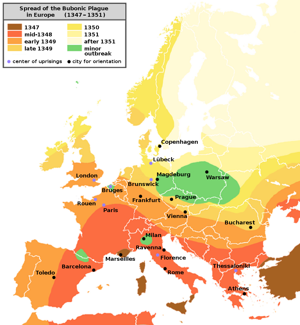
So it is still very unclear why references to zombies (and thus the locations of the undead) are so clustered. One final theory could simply be that we are only capturing the very beginnings of a global epidemic and that the zombie infection will start to move across the globe in the same manner in which plague did in the 14th century.

There is one final important issue to bring up. If we examine the Google Trends data for the term "zombie" we see that in most of the countries in which there already seems to be a major zombie outbreak there is already a great deal of vigilance (i.e. people doing searches for zombie related topics).

Google Trends Data Indicating the Number of Zombie Related Searches

However, why are Thais, Swedes and Finns doing so many searches? We can only suspect that the outbreak has already spread to those places, but has not yet been picked up by Google Maps at this early stage. Equally worrying is the fact that Germany is absent from this list. Either most Germans are blissfully unaware of the zombie rampage sweeping through their country, or it is already too late and most Germans have already joined the legions of the undead.

Hmm...the latter hypothesis would explain A LOT about our last visit to Germany.

February 18, 2010

Mapping Escorts, or what's up with Plano, TX?

The role of sex in the American economy (let alone, culture) is complex and exceedingly contradictory. While sex is used extensively to sell to the consumer-citizens of the U.S. (see any TV ad) it is also the focus of efforts to control it (who is allowed to marry) and regulate its sale (the illegal status of prostitution in most of the U.S.).

This latter issue is particularly convoluted as leafing through the back of many a local newspaper or postings at Craigslist (or other websites) will aptly demonstrate. There is any number of "escort services" for sale, with the majority presumably being a thinly veiled offer to exchange sex for money.

The wide spread availability of these listings led to today's maps which visualize the distribution of directory listings for "escorts" within Google Maps. The map of the absolute numbers of escorts identifies major urban centers as key sites for this activity, with Denver, Dallas, New York and Miami representing particularly large clusters.

Absolute Number of Escorts Listed in the Google Maps Directory


It is only through the analysis of the relative number of escort listings (see the map below) that more surprising patterns emerge.

Relative Number of Escorts Listed in the Google Maps Directory


Most large urban centers are still present although some such as Detroit or Salt Lake City are very small. Additionally, smaller cities such as Tampa, FL, Knoxville, TN, Tulsa, OK and Lexington, KY appear to have a much higher number of escort listings than their mere size would suggest. As Lexington is the U.S. home for floatingsheep.org we are somewhat nonplussed at this result. Who knew? Particularly since "Sin City" aka Las Vegas is completely absent in this map. Not really the category that Lexington's city council has been trying to get the city highly ranked on.

But the clear front-runner in this category is Texas in general and Dallas in particular which appears as the most specialized metropolitan area in escort services in the U.S. The nearby city/suburb of Plano contains the highest rank which leads inexorably to our final observation (apologies in advance) that…

...Debbie does Dallas, but prefers Plano.

February 16, 2010

Crescent City Cyberscapes

In honor of today's raucous Mardi Gras celebration in New Orleans, we present to you all a series of cyberscapes showing the concentration of numerous New Orleans eccentricities (some good, some bad). We'll mostly let the pretty pictures speak for themselves on this day of celebration, but notice the concentration of activity in these maps in both the French Quarter and the Lower Ninth Ward (see map of New Orleans neighborhoods below for reference).

All User-Generated Placemarks

Things get more interesting when you compare the distribution of placemarks for specific keywords. Unfortunately due to a technical glitch we do not have a map for the term Mardi Gras. But since a main element of the celebration in New Orleans is about processions, using the keyword "parade" provides a good sense of the distribution of activity on Mardi Gras with a large cluster in the French Quarter where the largest (and best known) parades occur.

But Mardi Gras is more than the French Quarter with neighborhood parades and celebrations being a key part of local identity. These events, known as "second lines", have a much different geography within New Orleans. Neighborhoods outside of the tourist district (such as Treme and Broadmoor) emerge as important (and non-tourist oriented) sites for Mardi Gras.

__Second Line_______Parade______
_

Other New Orleans cultural icons include mapping Beignets (clustered around the Cafe du Monde site) and Jazz. The map of jazz highlights both the French Quarter and the site of the annual jazz festival.

Beignet_______Jazz__
_

Some of most intriguing results are for the keywords "Hurricane" and "Katrina", each of which highlight parts of the city that were particularly hard hit in 2005. The Lower Ninth Ward neighborhood and the site of the levee break are particularly well documented.

Hurricane_______Katrina__
_

Anyone interested in Hurricane Katrina and Google Maps should see:
Crutcher, M. and M. Zook (2009). Placemarks and Waterlines: Racialized Cyberscapes in Post Katrina Google Earth. GeoForum 40(4): 523-534.

Map of New Orleans Neighborhoods (to orientate yourself)

February 12, 2010

Groceries, groceries and yet more groceries

Since the comparison between grocery stores and bars helped identify the beer belly of America, we thought it would be worthwhile to check out the distribution of grocery stores in general.

Unfortunately we were wrong. It is really rather uninteresting.

Don't even look at this map showing the absolute number of mentions of grocery stores in the Google Maps directly. It simply shows that they are everywhere that people are. DON'T LOOK!

Absolute Number of Grocery Stores Listed in the Google Maps Directory


Even when we normalize the data to create a measure of grocery store specialization, we end up with a big YAWN. Urban areas have more grocery stores per capita than rural areas.

Relative Number of Grocery Stores Listed in the Google Maps Directory


No doubt tied to the higher division of labor (e.g., more specialty grocery stores) that large centers of population have as well as the fact that urban areas have higher land costs and fewer available large parcels that results in a built environment of more (albeit smaller) establishments.

Wow… it's rather sad that we spent as much energy as we did to create this. It's boring. Much like the act of shopping for groceries. But like grocery shopping, it needs to be done. But hopefully by someone else, next time.

Apologies all around. Next post we'll show more interesting like urban maps of user generated references to crime or distribution of escort services…stay tuned.

February 11, 2010

Guest Map: Facebook Connections

We just saw this map of facebook linkages in the U.S. by Pete Warden and thought it well worth sharing. Very interesting data and great analysis/visualization


We'll get to our own maps tomorrow.

February 10, 2010

Where Users Like to Vacation

Over the past few months, we've published a number of maps showing the automatically- and user-generated online representations of place, from the seedy to the holy to the hoppy. Perhaps you've found yourself thinking, "I'd sure like to go there!", wherever there may be. So where exactly is it that people want to go?

The following maps show the incongruities between these automatically- and user-generated representations of place when searching for "tourism" and "vacation" in Google Maps. The values in each of the four maps were normalized using the national average for each search term, with any points not 20% greater than the average (indexed value >1.2) being excluded. These maps thus specifically show the places in which there is a higher-than-average concentration of placemarks (either user-generated or directory) mentioning the words "tourism" or "vacation".

Tourism: Directory

Tourism: User-Generated

Perhaps the starkest contrast between these maps of tourism is the much smaller number of user-generated placemarks as compared to the automatically-generated directory placemarks, usually drawn from pre-existing sources like the Yellow Pages. In moving from directory to user-generated representations, almost all rural locations disappear from the map, although the vast areas west of the Mississippi River with no information at all show that even some urban areas don't possess larger-than-average amounts of tourism-related information.

Vacation: Directory

Vacation: User-Generated

Shifting our attention to searches for "vacation", it is interesting that in this case, user-generated representations still have considerable coverage across the United States. Moreover user generated references to vacation differ from the "official" map of vacation based on Google Maps directory listings.[1] That is, "vacation" shows up most often in New York City in the Google Maps directory but user-generated representations show that Orlando, Florida, the home of Disney World, is the place to go on your coveted break each year.

God help us all.

Take note as well, that coastal areas all across the United States are prominent in the peer produced constructions of vacation, from the coastal Carolinas and Georgia to the Gulf Coast, and even throughout California, Oregon and Washington. So perhaps there is hope of eluding our mouse overlords after all.

Most importantly, these maps call our attention to the significant variances in how place is perceived online, depending on what measures are being used to represent these constructions. Even if it's possible to dig a hole through the planet on Google Earth, the difference between, and within, places remains as important as ever.

[1] This is also one of the few cases in which the maximum value in a map deviates from one of the nation's largest urban areas.

February 08, 2010

The Great American "Pizza" Map

Having spent considerable time over the past months analyzing the distribution of a number of strangely juxtaposed social phenomenon (ranging from religion to bars), today's map should come as no surprise to anyone. After all, isn't the comparison between the number of user generated references to "pizza", "guns" or "strip club" an obvious one to make? Perhaps not, but we're doing it anyway.

To our knowledge this is the first time that this particular set of fractures within American society have been mapped. And it is likely to be the last time as well, so don't blink.

The Great American "Pizza" Map


The map reveals that America seems to be largely pro-pizza with the red dots of pizza spreading across the landscape (the Midwest and Northeast seem particularly well endowed) like a rich and robust tomato sauce. Perhaps there is something after all that everyone can agree upon. (Although the unity behind pizza would likely break down over a fight between "New York" and "Chicago" styles.)

Moreover, there are a number of clusters -- represented by green dots – with more references to guns than pizza. We're not quite sure what life there is like (as we live in a particularly large swath of sauce) but it does give one pause for thought. Are these patches of green olives? Peppers? JalapeƱos? Pesto? In any cases, these clusters are predominately rural areas – where apparently there are more guns than pizza.

Lastly one sees a few scattered locations where strip clubs are more popular (we're looking at you Las Vegas) than either guns or pizza. Much like the token scattering of pineapple that one is forced to endure on pizza (there's always one person who suggests it!), strip clubs represents a decidedly marginal activity in the aggregation of human experience illustrated in this map.

In any case, this post has made us hungry so we're off to grab a slice.