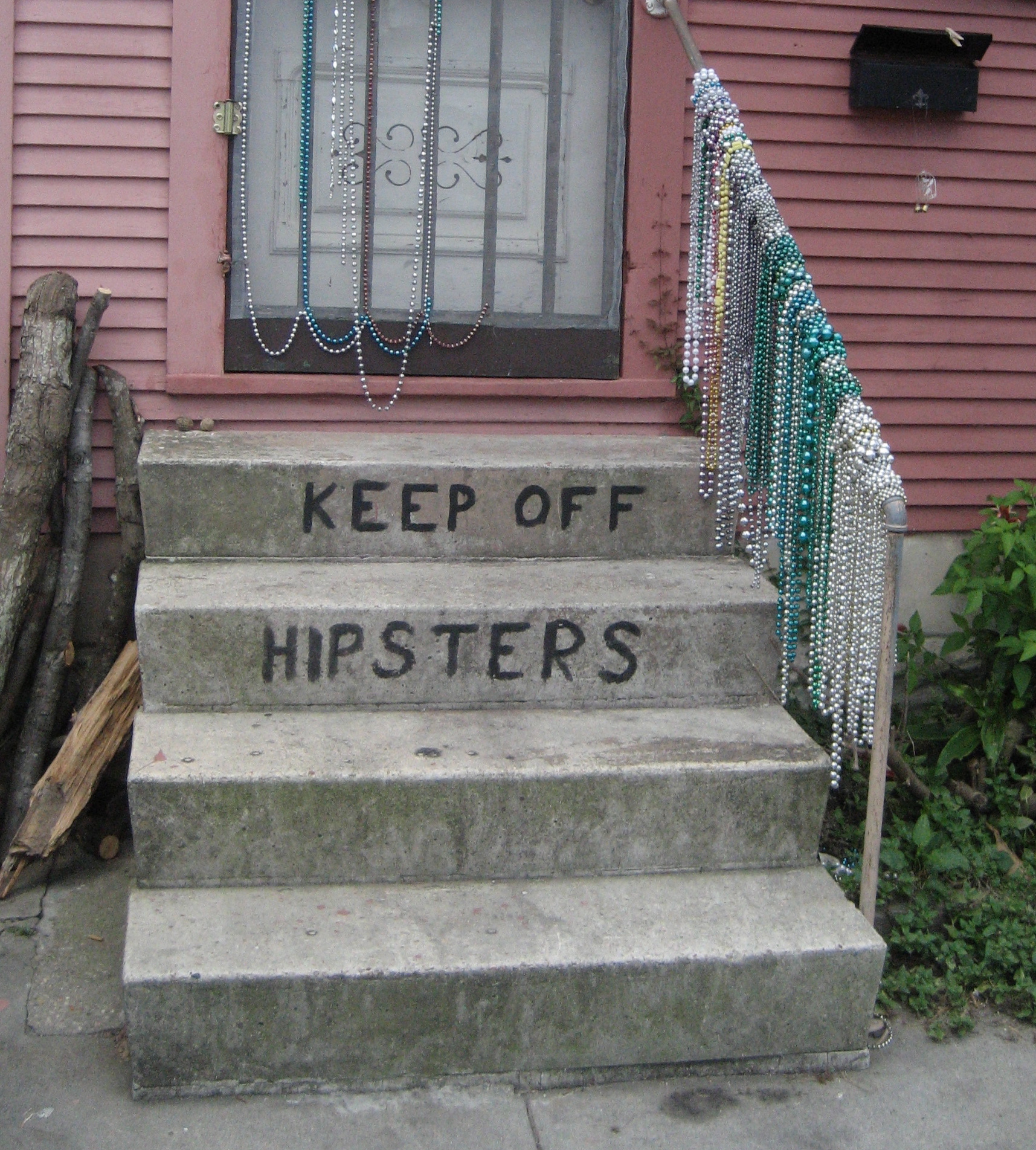
America traditionally likes to party. Well, at least engage in the throwing tea off ships into harbors and annoy-the-English kind of party. And let's face it, who doesn't enjoy annoying the English now and again?
Arguably poking fun at the English is the only activity that the two groups we are comparing today -- the new "tea party" movement and "hipsters" -- may share in common. Or not. Both groups probably enjoy a party and the occasional beer. Of course, "tea partiers" will be complaining about taxes on alcohol and "hipsters" will be drinking the beer ironically whilst watching other people party and discussing bands you've probably never heard of.
Unfortunately, parties really have very little (OK, nothing) to do with this post, but they are a (rather forced) way of introducing our comparison of online references to 'hipsters' and the 'tea party'.
Interestingly, America is covered by far more references to the tea party than to hipsters. There are a few pockets of expected hipsterdom: San Francisco, Los Angeles, New York City, and of course Seattle. But otherwise the country is characterized by far more online attention given to the tea partiers. But we need to ask why that is? Is it because tea partiers have an identity they like to flaunt, whereas hipsters might tend to see the essence of hipster identity in others rather than themselves? After all, who really ever admits to being a hipster?
Or perhaps the technology itself is an explanatory factor here. Whilst (hipsters love to use the term whilst) we are somewhat shocked that the tea party, or at least people who talk about them, are harnessing the power of a technology designed and sponsored by the American/socialist/fascist/Kenyan government that is the subject of so much of their ire, they nonetheless maintain an impressive web presence.
Hipsters on the other hand, undoubtedly are proficient social media users, but we doubt they are using the word "hipster" on their sleek tumblr pages. Perhaps it would simply not be ironic enough? Other varieties of hipster, like their tea-throwing brethren of yesteryear, might eschew modern technology altogether and communicate using hand written notes or retro typewriters or cool early 20th century printing presses requiring months of careful restoration. In any case, in contrast to tea partiers, hipsters' general lack of self-professed identity means that they are less likely to create digital traces explicitly referencing themselves online.
And, ultimately, this is the point of this post. Mapping keywords in Google is often an incredibly useful exercise, but it can take hipsters and tea partiers to demonstrate some of the significant methodological limitations of such an exercise.
November 16, 2011
November 14, 2011
Mapping Wikipedia Globally
Wikipedia is an incredibly impressive coming-together of human labour on a scale that the world rarely sees. Over the last few years, we've also seen a few maps of the encyclopedia (including some work on this blog) which have shown that the project is far from complete (whatever that might mean).
Each one of these yellow dots represents human effort that has gone into describing some aspect of a place. The density of this layer of information over some parts of the world is astounding. Some of our future posts will look more closely at measures of inequality in Wikipedia, but it is still hard not to be awed by this cloud of information about hundreds of thousands of events and places around the globe.What we can also do is compare the English Wikipedia to the Arabic, French, Hebrew, and Swahili versions (these languages are chosen because they are the subject of the research project mentioned above).
This map should be interpreted with caution for a few reasons. First, it only displays content from six Wikipedias (there are currently 282 of them). Second, many articles in multiple languages appear in the same place. The reason for this is that they are articles about the same feature, event, or place: albeit in different languages. This means that when mapping those features, the dots in each language will show up on the map in exactly the same place. As such, we get a lot of overlapping dots. And dots that higher up in the legend will then necessarily show up on top of others.
The map still remains useful to show some of the different geographical foci of different linguistic groups. In Iran, for instance, there are more articles in Persian than any other languages in our sample. We see more articles about Quebec and parts of North Africa in French, and then a complicated mix of Arabic, Hebrew, English and French in the Levant.Nonetheless it remains that there are far more English language articles than articles in any other language. As such, it remains that if your primary free source of information about the world is the Persian or Arabic or Hebrew Wikipedia, then the world inevitably looks very different to you than if you were accessing knowledge through the English Wikipedia. There are far more absences and many parts of the world simply don't exist in the representations that are available to you.
That doesn't mean we should stop mapping the project though, and as part of a multi-year project to study Wikipedia in the Middle East, North Africa, and East Africa, we present this global-scale maps of every article in the November 2011 version of the English Wikipedia.
The English encyclopedia is by far the largest, and currently hosts almost 700,000 geotagged articles (click on the image for a larger and more detailed version):
Each one of these yellow dots represents human effort that has gone into describing some aspect of a place. The density of this layer of information over some parts of the world is astounding. Some of our future posts will look more closely at measures of inequality in Wikipedia, but it is still hard not to be awed by this cloud of information about hundreds of thousands of events and places around the globe.What we can also do is compare the English Wikipedia to the Arabic, French, Hebrew, and Swahili versions (these languages are chosen because they are the subject of the research project mentioned above).
The map still remains useful to show some of the different geographical foci of different linguistic groups. In Iran, for instance, there are more articles in Persian than any other languages in our sample. We see more articles about Quebec and parts of North Africa in French, and then a complicated mix of Arabic, Hebrew, English and French in the Levant.Nonetheless it remains that there are far more English language articles than articles in any other language. As such, it remains that if your primary free source of information about the world is the Persian or Arabic or Hebrew Wikipedia, then the world inevitably looks very different to you than if you were accessing knowledge through the English Wikipedia. There are far more absences and many parts of the world simply don't exist in the representations that are available to you.
November 10, 2011
The Rise of the Slacker Strata
"The key to economic growth lies not just in the ability to attract the creative class, but to translate that underlying advantage into creative economic outcomes in the form of new ideas, new high-tech businesses and regional growth."--The Rise of the Creative Class, p. 244We suspect that many of our readers are familiar with Richard Florida’s argument about the creative class and its connection to economic development. His very provocative and controversial ideas about how cities and regions can strategize for home-grown innovation and economic growth offer a welcome relief to many from stadium building boondoggles in urban areas across the world.
But of course, given the streak of contrariness (or sideways thinking) that epitomizes the FloatingSheep collective, we began wondering what the opposite of the creative class might be: The Boring Bourgeoisie? The Insipid Intelligentsia? The Lackluster Lineage? The Dull Derivation? The Mundane Moiety? Apologies, but once you get started it is hard to stop.
Even more fun, is thinking about the kind of public policy initiatives that could be put in place to attract these populations. Although we admit we’re at a bit of a loss as to why it would be in cities’ interest to do so.
Then it occurred to us that our two most popular maps – the Price of Weed and the Beer Belly of America – contained within them the means to provide a metric of sorts for the anti-creative class. Or at least places where the ability to be usefully creative would be severely compromised, i.e., where the price of marijuana is low and the available of bars is high [1].
In other words, we're looking for the Slacker Strata of America, the list that no city wants to be on.
Given the short attention span of our target audience for this map (the Slacker Strata) we kept our analysis simple and just “smushed” the Beer Belly map together with the Price of Weed map and added some more appropriate symbology.
The Slacker Strata
(please click for a larger version of this map)
Given the decidedly flippant approach to this map, interpret with care. One thing that does jump out is that many places that have a relatively high level of geotagged information about bars, also have relatively high prices for marijuana. Wisconsin and Minnesota (with the high concentration of PBR cans in the map) consistently show up as high price locations according to the Price of Weed data. Likewise, the places with the lowest marijuana prices generally do not have high numbers of bars, with the possible exception of Northern California and Taylor’s hometown of Louisville, KY.
Nonetheless, this visualizes an intriguing relationship, leading us to make an initial hypothesis that these two goods largely act as substitutes to one another, at least when considered at the macro-scale. This idea, of course, still needs testing so hold off on any public policy decisions!
btw, this map is now available in t-shirt form!
Stay tuned for our next post when we map hipsters!
[1] We’re sure that some readers are bound to argue that they are at their most creative when partaking. We have our doubts and request that said readers review the documentary evidence provided here, here, and here.
November 07, 2011
Where are visitors to Floating Sheep coming from?
Recently we were wondering about our own user generated geographies and took a look at Google Analytics to see some stats on our visitors. We were hoping to download and geocode/map IP addresses but Analytics doesn't seem to keep that. So instead here are some of the maps (which annoyingly use the Mercator projection) that were available.
First, we've had visits from 201 countries/territories. If anyone knows someone in Turkmenistan, Western Sahara, Guinea, Sierra Leone, Liberia, Niger, Chad, the Central African Republic, Congo, Gabon, or Suriname please pass the link along. We'll take care of getting our long time nemesis Kim Jong Il of North Korea to look at us.

Dropping down to the city level, we note that we've had visitors from over 19,000 different cities. The top cities are (1) New York, (2) London, (3) Chicago, (4) San Francisco, (5) Washington, (6) Lexington, (7) Madison, (8) Seattle, (9) Los Angeles, (10) Minneapolis, (11) Sydney, (12) Portland, (13) Oxford, (14) Austin, (15) Denver, (16) Milwaukee, (17) Dallas, (18) Houston, (19) Atlanta, (20) Melbourne, (21) Philadelphia, (22) San Diego, (23) London, (24) Singapore, (25) Tucson, (26) Paris, (27) Toronto, (28) Berlin, (29) Cambridge and (30) Moscow.
But enough navel gazing...we'll get back to our regular maps next post.
First, we've had visits from 201 countries/territories. If anyone knows someone in Turkmenistan, Western Sahara, Guinea, Sierra Leone, Liberia, Niger, Chad, the Central African Republic, Congo, Gabon, or Suriname please pass the link along. We'll take care of getting our long time nemesis Kim Jong Il of North Korea to look at us.
Dropping down to the city level, we note that we've had visitors from over 19,000 different cities. The top cities are (1) New York, (2) London, (3) Chicago, (4) San Francisco, (5) Washington, (6) Lexington, (7) Madison, (8) Seattle, (9) Los Angeles, (10) Minneapolis, (11) Sydney, (12) Portland, (13) Oxford, (14) Austin, (15) Denver, (16) Milwaukee, (17) Dallas, (18) Houston, (19) Atlanta, (20) Melbourne, (21) Philadelphia, (22) San Diego, (23) London, (24) Singapore, (25) Tucson, (26) Paris, (27) Toronto, (28) Berlin, (29) Cambridge and (30) Moscow.
Labels:
demographics,
floatingsheep
November 03, 2011
Geocoding Historic Photographs in Lexington, KY
As part of my undergraduate iWorlds class this semester, I assigned students the task of geocoding historic photographs of Lexington, KY. The photos, which are available online in digital format, are housed at the Kentuckiana Digital Library at the University of Kentucky and have metadata that includes street addresses, albeit usually embedded in a paragraph rather than as a separate field.

After aggregating all the students' work, I played around a bit with some kml code and ended up a map of 500+ geocoded historic photographs. I’ve posted the kmz file which can be opened in Google Earth. Click on a placemark and you can see the photograph and a link to the KDL entry. Thanks to Matt Wilson for alerting me to these photos and Deirdre Scaggs for helping us access them easily.

After aggregating all the students' work, I played around a bit with some kml code and ended up a map of 500+ geocoded historic photographs. I’ve posted the kmz file which can be opened in Google Earth. Click on a placemark and you can see the photograph and a link to the KDL entry. Thanks to Matt Wilson for alerting me to these photos and Deirdre Scaggs for helping us access them easily.
October 31, 2011
Happy Halloween from Floating Sheep, Part II: A Zyberscape of Zweets
The denizens of Floating Sheep space are beginning to explore Twitter and there is a need to experiment with the API interface and various datasets. So what better way to do this than to use zombies! [1] So that we can visualize "a zyberscape of zweets"!
Location and Relative Amount of Tweets referencing Zombies (Zweets) Worldwide
Ate Poorthuis (a Ph.D. student at the University of Kentucky) spear-headed (pun intended) the zombie data collection process, which is relatively straightforward. The method was to use Twitter's Streaming API to download all zombie-related tweets between October 28 and October 31. We collected all messages containing references to zombies, undead and the apocalypse which appeared at a rate of about 45 tweets per minute for a total of 230,000 tweets. That's a lot of zombie angst!
We also thought it would be interesting to look at other forms of zombie-tude and turned to the fount of all knowledge to search the term "zombie politician" which returned many references to Newt Gingrich. So we added Newt to the list of search terms. Unfortunately there were so few geocoded tweets referencing Newt (perhaps lending some credence to the zombie politician label) that the resulting map looked as sparse as the teeth in a .... wait for it .... zombie. Rimshot!
Unfortunately, only 1.1% of those tweets were geocoded. While the profile of each Twitter user also contains a user-defined location field we decided to only use the coordinates of the actual tweet. These can be generated by a GPS-enabled phone or by 'smart' Twitter clients. Most tweets are geocoded to a specific point but others refer to a polygon (e.g. a city), in which case we've used the centroid of the polygon.
In any case, the end result is a database that shows the location of geocoded tweets containing the keyword "zombie". A few tweaks and the acquisition of a nice zombie icon later resulted in the cyberscapes (or perhaps more accurately zyberscapes) of zombie tweets (also know as Zweets) featured above and below. While the normal patterns of technology use are present (high concentrations in the U.S. and Europe) there are also a relatively large number (compare to other aspects of the geoweb) of references in Indonesia and South America
And for those interested in a closer look at the U.S., please see below.
Location and Relative Amount of Tweets referencing Zombies (Zweets) in the U.S.

---------------------
[1] OK, there are probably lots of other and better ways to do this, but its Halloween!
Happy Halloween from Floating Sheep: Zombie Corn Mazes
The Floating Sheep collective is always looking for new aspects of socio-spatial life to map and holidays are always a good excuse. Unfortunately, between teaching, cleaning out the rain gutters, writing, traveling, cleaning out the $%#* gutters again, reading, and day-to-day life, Halloween has snuck up on us. So to quote Monty Python, the maps today "have been completed in an entirely different style at great expense and at the last minute".
Regular readers already know about our fascination with the zombie trope (See our seven part series on "Preparing for the Zombie Apocalypse") and it should come as no surprise that we return to the topic today. Especially after the massive zombie walk in downtown Lexington last night. This time, however, we decided to spice up the map a bit albeit at the loss of such "optional" things like a legend, an orientation reference and the ability to convey information in a clear manner.
References to Zombies
References to Corn Mazes
References to Voldemort
Labels:
corn mazes,
halloween,
voldemort,
zombies
Subscribe to:
Posts (Atom)


